It’s a regular Tuesday morning. You wake up at 8:00 AM, brew yourself a fresh cup of coffee, and sip it to the melody of your kids screaming in the background. You look outside, trying to find some inner peace.
Instead, you find a huge oval-shaped object hovering a few feet off the earth.
Your phone vibrates. You quickly scan the headlines. There are twelve of these things, all around the world. Investigators say they’re extraterrestrial spaceships, with aliens inside. The aliens have all the answers humankind has been looking for, but investigators can’t seem to make sense of the sounds and shapes they’re making.
Imagine that (or just watch Arrival).
This is exactly what it feels like to look at large datasets. At first, they seem like gibberish—even when we know that they contain valuable information. And just like the governments of Earth sent in an interpreter to understand what the aliens were saying in Arrival, we use “interpreters” every day to make data more comprehensible.
Our interpreters just happen to take the shape of KPIs, graphs, and dashboards.
As one of the most powerful tools available to marketers and storytellers of all kinds, data visualizations are a vital part of communicating a clear and impactful story. Visualizations offer a medium through which we can readily access and understand the objective truths within our data. We use them to design products or services, send out marketing campaigns, and conduct outreach.
But creating data visualizations is much more complicated than one might think. With a few small design changes, the same dataset can be used to create visualizations that communicate radically different messages...
Wake-Up Call
In 2011, information graphic producer Simon Scarr designed the following data visualization for an article published in the South China Morning Post.
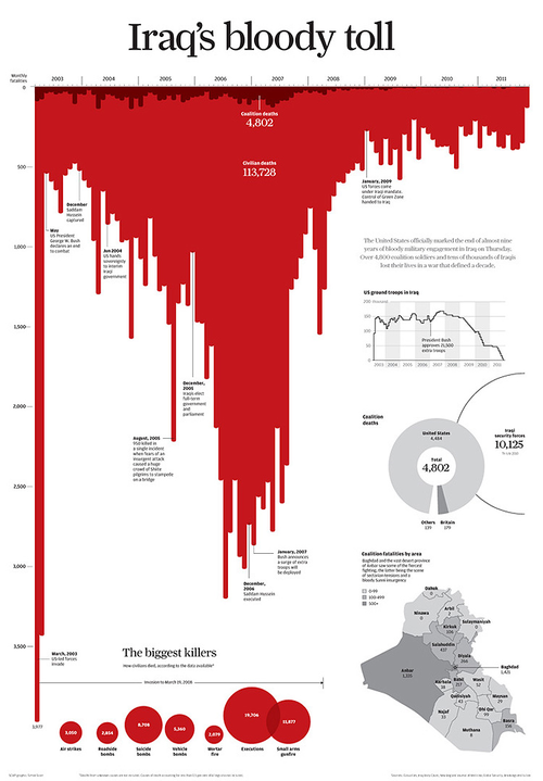
Considered one of the most iconic data visualizations published in recent years, it offers a perfect example of how visualizations can lead the viewer to interpret objective data in very particular ways—that is, how data visualization can be used to tell a story.
The United States’ war in Iraq had been going on for eight years when Scarr's visualization was first published. He felt that the world was getting desensitized to the number of people being killed daily. He wanted his visualization to act as a reminder of the suffering and death of over 100,000 people.
The three main elements that set the tone of his visualization: the title, the color, and the orientation of the chart.
By using a negative title like “Iraq’s bloody toll,” Scarr is telling the viewer how to interpret the dataset—in this case, the number of deaths in Iraq during the time of US occupation. He sees the number of deaths as alarming, which is also transferred to us, the viewers. A more neutral title, such as “Number of Deaths in Iraq,” would likely not induce such an emotional response.
But what is most striking about the graph is the intense color of the bars. Red is a powerful color: it catches our attention easily and is often associated with warning or danger. In this case, it was also used to make it appear as if blood were running down the graph.
Lastly, the bars point down, which is not common for bar charts. As previously mentioned, the shape the bars create, especially when colored red, makes it look like there is blood dripping down the page. However, this is not the only reason why the bars were flipped. Studies show that we tend to associate “down” with “bad” and “up” with “good”. In this example, Scarr wants viewers to think of the number of deaths in Iraq with horror—and so the bars point down.
These three elements combined result in a strong emotive response from the viewer.
Would the dataset have the same impact if there were some slight changes to the graph? If the bars had a different color or were placed differently on the page?
To illustrate the power that design choices can have on the way a given dataset is interpreted, journalist Andy Cotgreave took Scarr’s graph and presented viewers with an updated version of it, keeping the numbers and scale exactly the same while changing three key design elements:
- Rewrote the title
- Changed the color of the bars from red to blue
- Flipped the graph vertically so that the bars point up
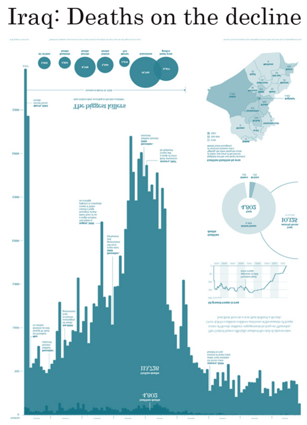
The new title, “Iraq: Deaths on the Decline,” is much more positive. It primes viewers to look at the overall decreasing trend in the number of deaths, rather than focus on the total number of lives lost. The color blue is one that is associated with the feeling of calmness. In its own way, the color tells viewers: “You can relax, the war is almost over.” Finally, when the graphs point up, the downward trend becomes more apparent.
Cotgreave’s point is clear: small changes in the way numbers are presented can have a big impact on the way people feel about them. The same dataset, in other words, can tell many different stories.
Scale Matters
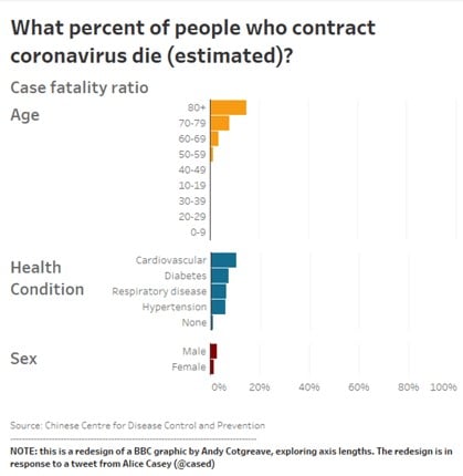
Sometimes, subtler cues can cause a difference in how we perceive data. At the start of the pandemic, the BBC released the graph below based on data from the Chinese Center for Disease Control and Prevention. It showed the percentage of deaths caused by COVID-19 based on age, pre-existing health conditions, and sex.
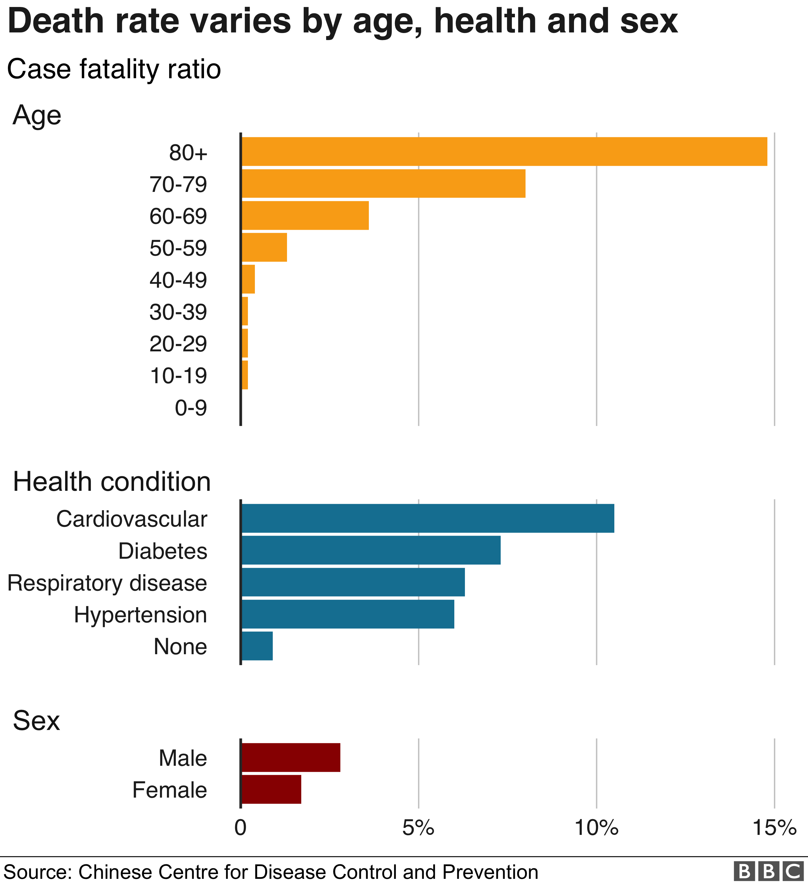
This graph received some backlash. Readers were shocked to see that so many people aged 80 years and older died after contracting the virus. This reaction was due to the readers’ predisposition to think that the length of the x-axis represents 100%. In the case of this graph, the x-axis represents 15%. The visualization below shows what this graph would look like if the scale was changed.
Experts at Tableau, a leading data visualization software company, even suggested adding in the percentage of those who recovered. They then took it a step further and flipped the graph to place more emphasis on the percentage of people who survived. The title of the graph also varied between the three iterations to match the message behind the visualization.
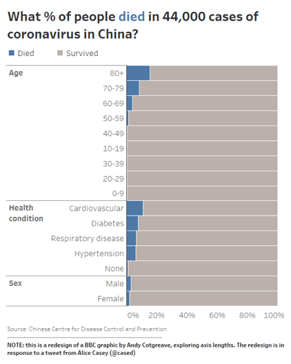
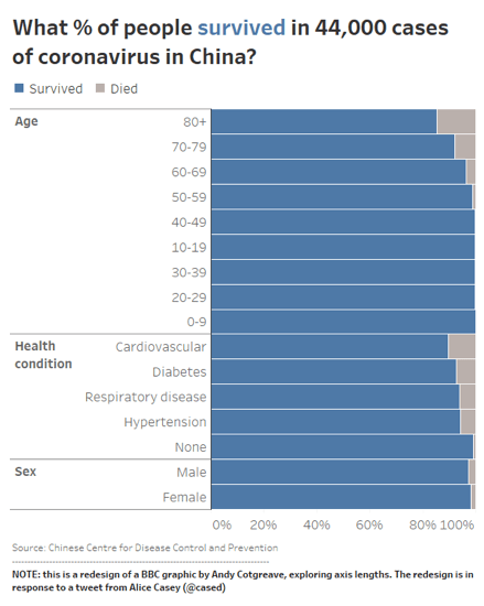
Although all iterations show the exact same numbers, changing the scale of the graph and adding in complementary information communicates a different message.
The Big Picture
What’s more, the impact of our design choices on the stories we tell isn’t limited to single visualizations alone. Data visualizations also have an impact on each other, when they are presented as part of a larger whole.
At certain white-collar jobs, for instance, we often combine multiple graphs to create dashboards, which are then used together to form larger presentations. We use these dashboards to tell our audience—boss, clients, or coworkers—everything they need to know about a particular project at a given point in time.
However, putting multiple graphs together adds layers of complexity. We need to make sure each graph is effective on its own, but also create connections between the graphs to help the viewer see the bigger picture.
A consulting firm submitted the below dashboard to Storytelling With Data (SWD), a company that works on making data visualizations more effective. The consulting company created this dashboard to understand why they are not winning projects they submitted proposals for. They wanted to use this data to determine where to focus their resources in the coming year.
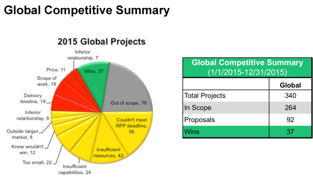
At first glance, we notice a color-coded pie chart and a table. Since they’re placed together, we can assume they’re related. It’s also easy to spot the 37 wins in both graphs, and we assume that the sum of all projects in the pie chart amounts to 340, as stated in the table.
Apart from that, though, the connection between the two charts is not clear. Since there is no legend, it is difficult to know what the colors in the pie chart represent. To make sense of the dashboard, we are required to find the sum of all projects in the same color category, and then compare that total with what is found on the table. By the time we go through all of these steps, we may not even want to continue the analysis and extract insight!
To fix this problem for the client, SWD redesigned the dashboard and connected all of the dots.
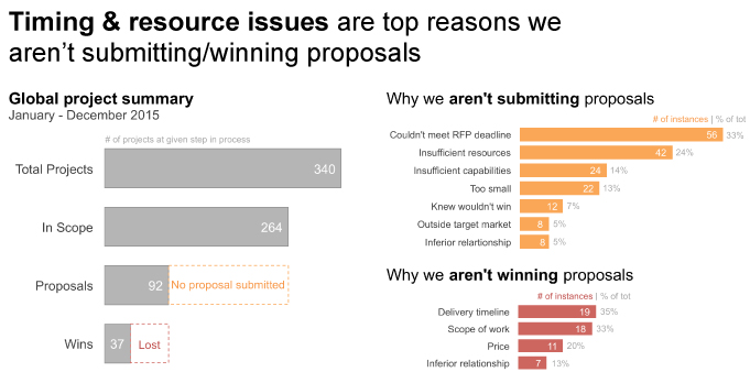
The main change we see is that the two graphs were broken down and replaced with three bar graphs.
The one on the right represents the data previously found in the table. By using bars, we are able to compare different categories without reading the numbers.
SWD also added a dotted box to make more sense of the white space in the graph. It tells us that the difference between the “In Scope” and “Proposals” bars are the cases where no proposals were submitted. This may seem obvious to some, but explicitly outlining this area provides additional context. The color orange used also makes it easy for us to associate this area with the top chart on the right, which explains the reasons why proposals were not submitted. This data was previously put in the pie chart. The same thing was done for “Lost” projects.
Another main change is the title. "Global Competitive Summary" was replaced with “Time & resources are top reasons we aren’t submitting/winning proposals.” This tells us what the insight is, and shifts our focus from trying to figure out what the graph says to thinking about ways to increase resources.
What to Keep in Mind
While data visualizations can sometimes be created with a simple click, they also require us to pay careful attention to the stories we are trying to tell through data, and make sure that our design choices support what we’re trying to communicate. Here are a few things worth keeping in mind to design effective graphs.
Set a Goal
We saw in this post that while data is objective, visualizations can be used to make the viewers feel certain emotions. What is the purpose of the graph you are putting together? Let this objective guide your work.
Know Your Audience
Who is going to see this data visualization and what expectations and biases do they already have? Some of these expectations are almost universally shared. One example of this is the association of “down” with “bad” and “up” with “good,” as we saw in Scarr’s graph. Another common association is that dotted lines represent estimates or reference lines, as was the case in the dashboard. Some expectations can be more specific to the industry or background of your intended audience.
Identify the Information You Need to Include
What information will help the viewer come to a well-informed conclusion? As in the final two iterations of the BBC graph, will including additional information be helpful for your audienceto understand the full picture?
Consider the Visual Elements
In the same way branding can affect how people perceive a product, visual cues such as colors, titles, captions, annotations, and page layout affect how viewers perceive your data visualizations. Having “Amount of Funding Raised” as a title will tell a different story from the same graph with the title “We Have Been Receiving More Funding.”
Get Someone's Opinion
Show your visualization to someone with a similar background as that of your intended audience. What are their initial thoughts or reactions? What follow-up questions do they have? Taking notes of these comments will help you understand if you are going in the right direction, and how you can improve.