Overview
Connecting Cultures, Staying Relevant: Rebranding a Nonprofit Museum
With a collection of nearly 4 million artifacts and objects, the Phoebe A. Hearst Museum of Anthropology had a reputation as a one-of-a-kind resource within the academic community—but its aging brand and outdated technical infrastructure made it hard for the institution to connect with a wider audience.
Powered by new leadership—and infused with a radical vision of the organization's future—the Hearst Museum was ready and eager for change. And we were excited to help it attract and retain new audiences, make its products and services more user-friendly, and fulfill its mission to share anthropology with the world.
Taking a cue from our anthropologist clients, we immersed ourselves in the culture of the Hearst Museum to gain both broad and deep understanding of its unique context: taking in its onsite exhibits, conducting stakeholder interviews and focus group discussions, and completing a competitive analysis. Through our research, we identified two distinct user segments: younger college students and older anthropology “enthusiasts.”
The new brand needed a message that would appeal to both of these distinct audiences. Working together, we found it: anthropology as a way to participate in the world.
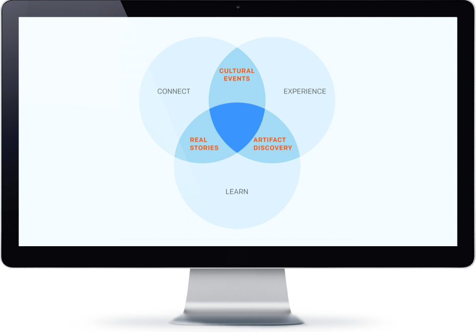
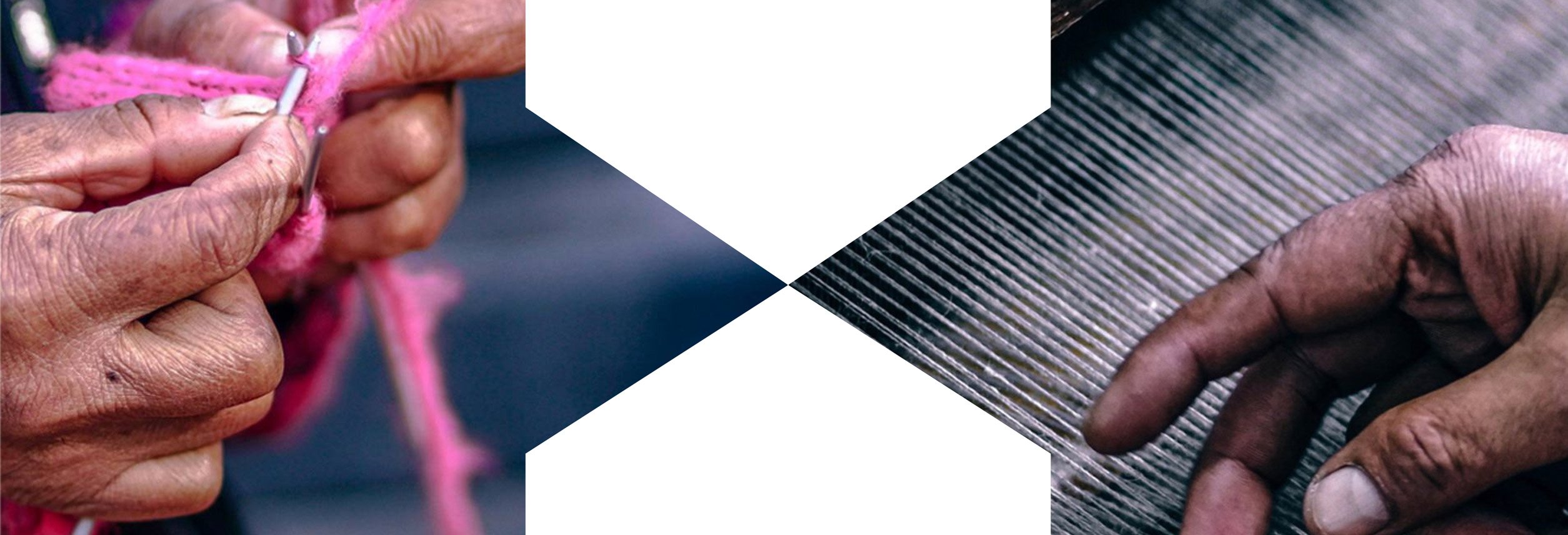
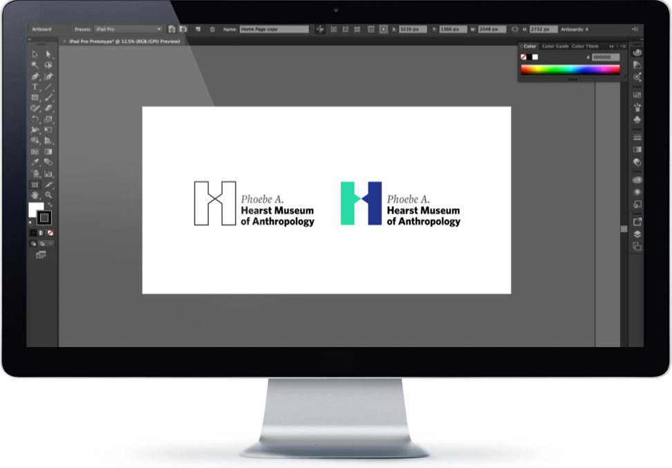
Additional work helped the Hearst Museum further refine its brand message. To help the organization visually communicate its goal of connecting cultures, we developed a brand identity based on a modified version of the Hearst "H," which emphasized the joining of the two vertical strokes via the horizontal.
We also developed updated website messaging and architecture that encouraged further interaction from users, to help the brand fulfill its promise of connection. Beautiful and practical, the proposed information architecture was designed to make finding information and engaging with the Hearst Museum easier than ever.
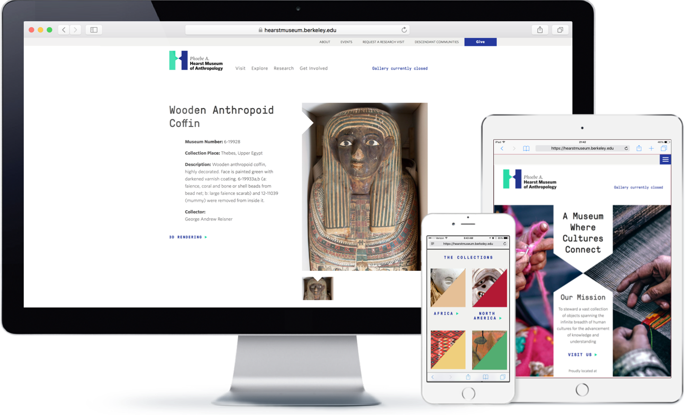
With the groundwork laid out, it was time to build. We overhauled the organization's website, creating dynamic page templates in line with high accessibility standards (WCAG 2.0 AA). The new website maximized flexibility and usability for the Hearst team, enhanced reservation and donor experiences, and allowed end-users to fully immerse themselves in the Hearst Museum's remarkable online collections.
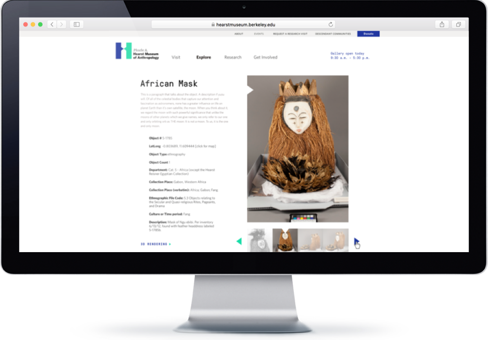
The Hearst Museum's new website—and the robust brand platform on which it is based—have helped the organization meet its goal of connecting cultures by offering a visually pleasing, easy-to-use experience to a wide variety of audiences. Well-crafted messaging, an accessible format, and dynamically connected integrations make it easy for end-users to find content and engage with the Museum more deeply than ever before.
