
Overview
"Upstream": Positioning a Mission-Driven Healthcare Brand for Growth
HealthBegins—an organization focused on improving health by promoting equity—was at an inflection point. The company had an opportunity to grow and become to be the go-to resource for organizations to looking to implement "upstream" healthcare practices. HealthBegins needed to establish an authentic, credible brand identity and voice that resonated with their audiences in the industry, but also set them apart as a truly innovative, unique, solution-focused organization. We stepped in to help them find a brand position they could occupy with confidence, and create the materials to own it.
HealthBegins holds a unique viewpoint on healthcare. Working together, we quickly realized that positioning such an organization would involve more internal than external research. We ran workshops with the HealthBegins team to nail the vision, mission, and strategy of the organization using our Unsafe Thinking framework. This helped us reveal some key insights to explore with the brand.
We learned that HealthBegins could be compared to a tugboat—a small, strong, and nimble craft that guides bigger ships through unknown, potentially dangerous waters.
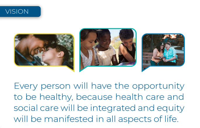
Similarly, HealthBegins is a catalyst in the upstream healthcare space, using its unparalleled expertise to help larger organizations navigate what is, for many, an unfamiliar territory. We worked with the company to identify colors, imagery, and icons that would evoke a sense of power, passion, optimism, and empathy, laying the groundwork for a brand identity that would complement its mission:
"HealthBegins—helping guide some of the biggest ships in the healthcare business upstream."
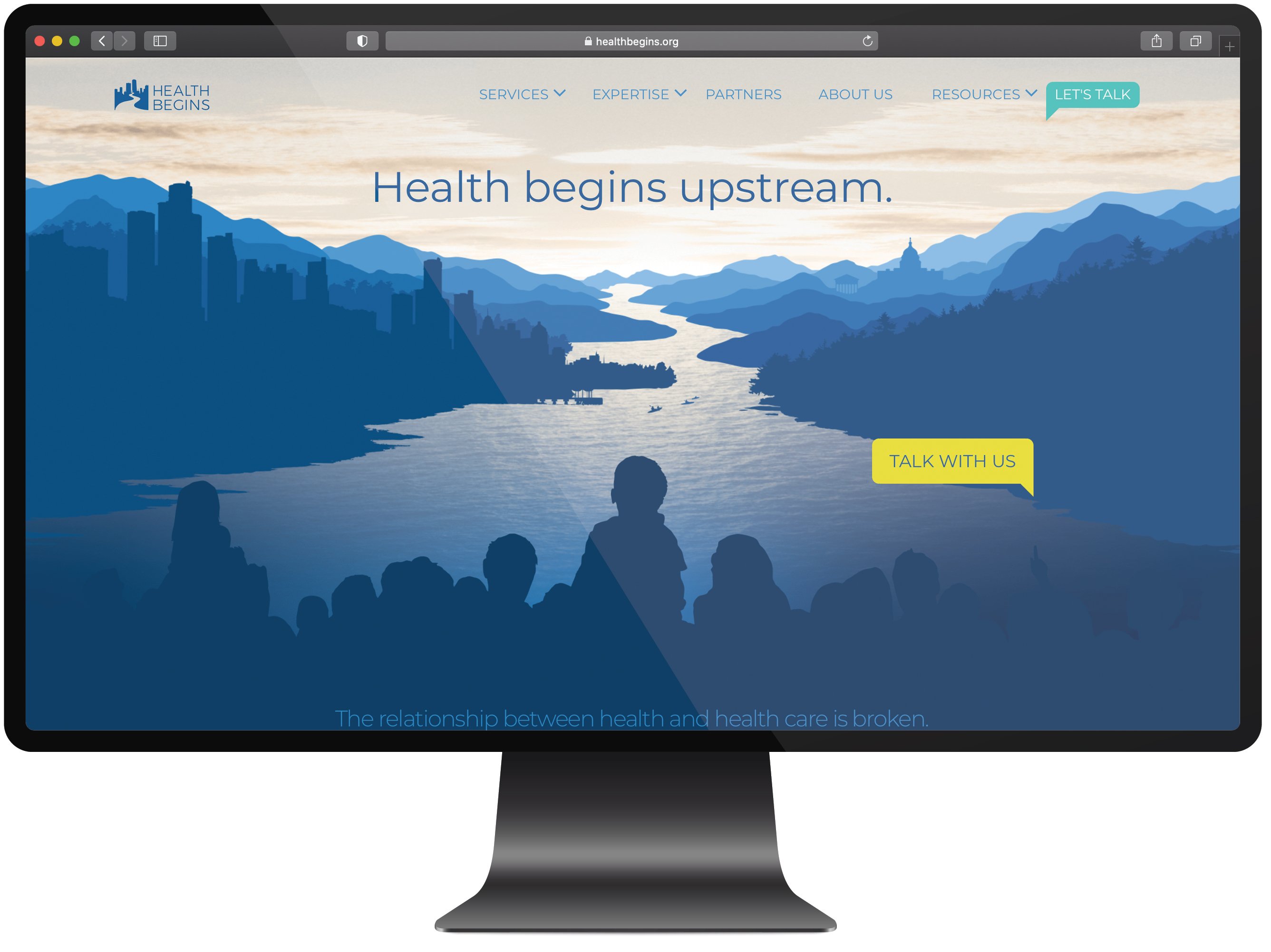
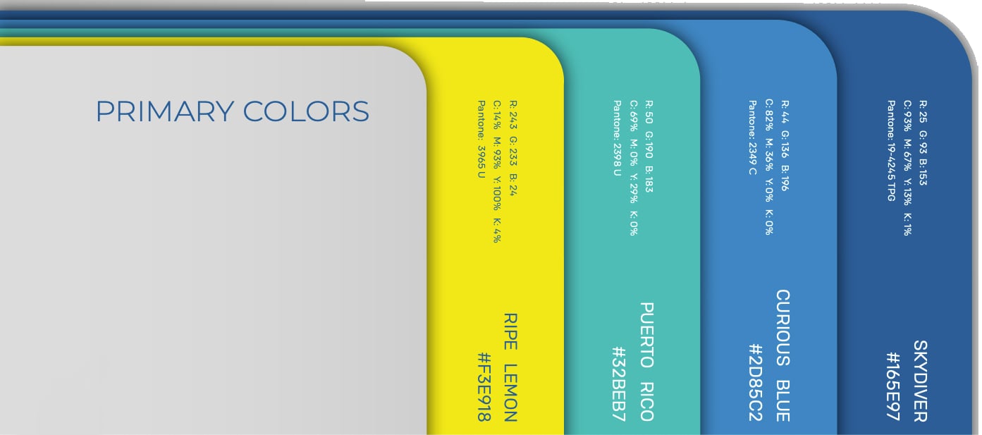
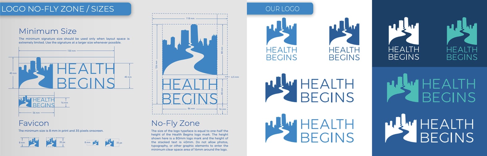
To help establish immediate trust with the large organizations that HealthBegins is best-suited to assist, we created a fresh logo with a blue, yellow, and white color scheme applied as part of a new, more modern design system.
We also updated the HealthBegins website for improved communication—streamlining its information architecture, curating its imagery, and incorporating subtle animations and parallaxes that reveal the many layers of the organization's work. The new visual hierarchy aligns with their layers of services to represent a new way of thinking as a critical part of the revitalized HealthBegins brand.
In addition, we consolidated the company's resources in a single, centralized hub, allowing HealthBegins employees to showcase their work and share the tenets of their philosophy with key partners and clients.
The new website and brand is widely appreciated by the current HealthBegins team and clients, and has helped the team with lead generation and client engagement. We continue to work closely with the organization to host and manage its website with iterations, new enhancements, and features based on real-world data and feedback.