Overview
From Data to Story: Helping a Non-Profit Explain Its Impact
Tipping Point Community is an organization dedicated to fighting poverty—making it one among thousands competing for attention and funds. This unique foundation needed a story that would help it stand out from the crowd. We were eager to help them tell it.
To begin, we reviewed a mass of data and impact reports, combining interviews and trends to help Tipping Point Community distill what makes it special, and tease out a story that would attract both funders and grantees.
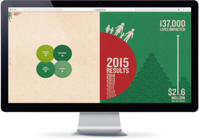
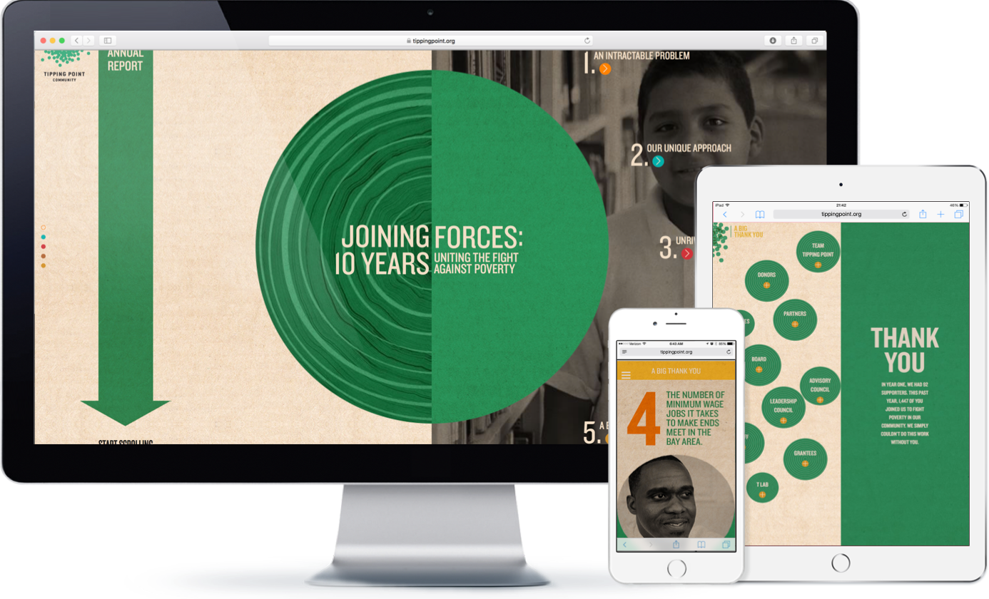
Traditional annual reports leave much to be desired. For Tipping Point’s 10 Year Anniversary, we wanted to create a digital story as compelling as the work they do.
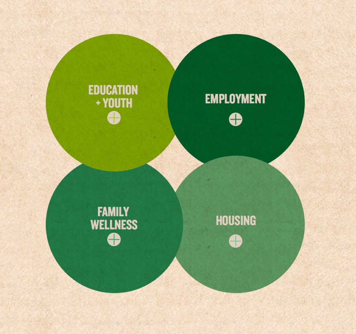
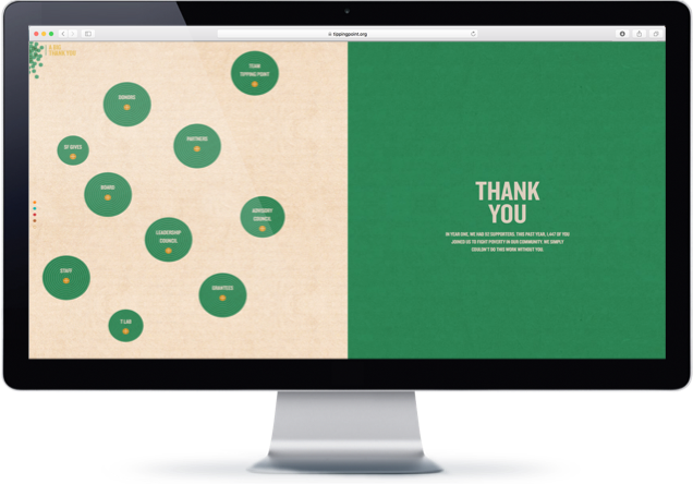
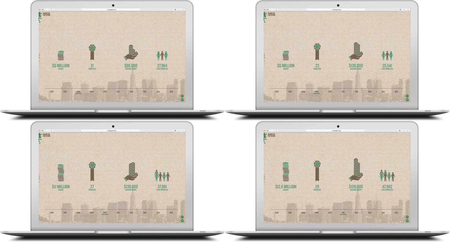
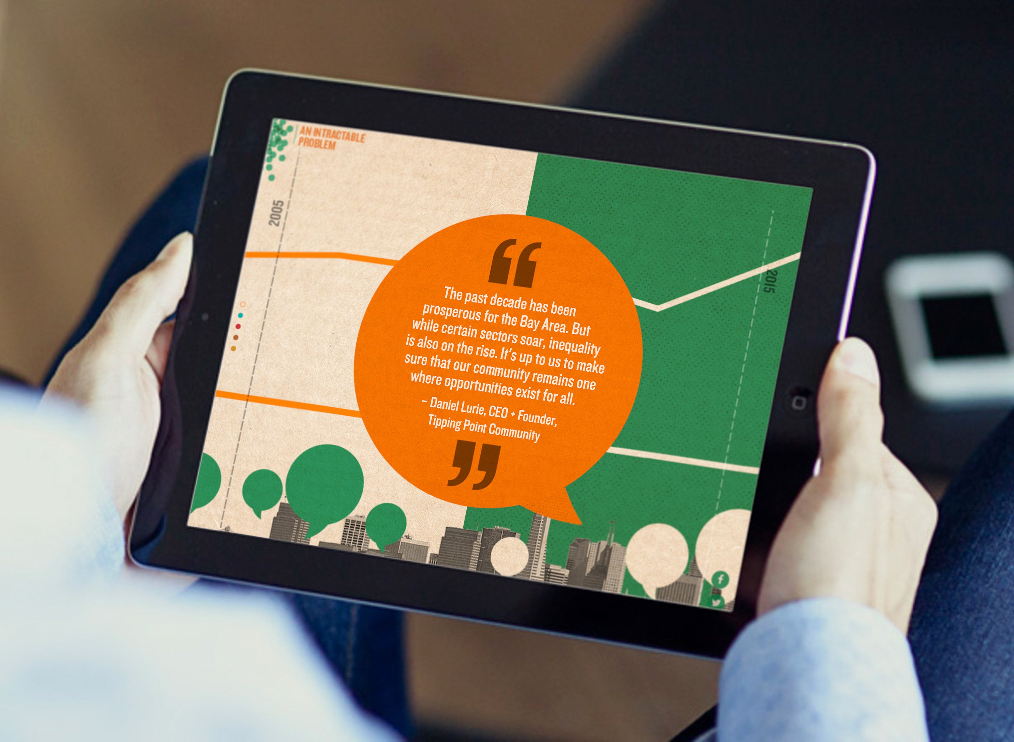
We saw a way to use the dual nature of giving—investing on the one hand, and the corresponding impact on the other—as a UX design framework that would inspire folks to engage with the report in unexpected ways. In order to tell the story in more than words, we created a user interface and a user experience that speaks for itself.
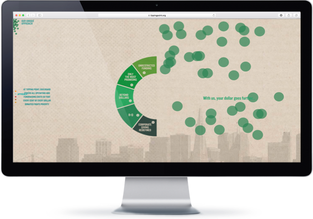
Initial design work ultimately led to a highly interactive online experience, balancing data and metrics with real stories from the people whose lives have been affected by poverty—and by Tipping Point Community's incredible work. The organization’s uncommon grant-making philosophy and approach were highlighted with a unique interface which has allowed the report to make an incredible impact.
